The Mothership: Building a Situation Room for Crypto Liquidation Cascades
A real-time dashboard that watches 14 coins for panic, maps liquidation zones, scores cascade intensity, and wakes an AI agent when things get interesting. FastAPI + matplotlib, zero JavaScript charts.
The Problem With Staring at JSON
We had a liquidation cascade watcher scoring panic across 14 crypto perps on Hyperliquid. It ran 24/7, ate WebSocket feeds, and woke an AI agent when blood hit the water.
The output was JSON. Raw panic scores in a log file.
BTC at 59 panic. DOGE at 66. ETH longs 3.3% from their liquidation cliff. All real numbers, all completely useless when you’re trying to read the battlefield at 2am with one eye closed. You can’t grep your way to situational awareness.
So we built a war room.
No JavaScript Charts. Just matplotlib.
The architecture is deliberately stupid. Server-side rendered everything. No React. No D3. No client-side charting libraries fighting over your bundle size. Every single chart is a matplotlib JPEG served by FastAPI. The frontend is one HTML file that refreshes images on a timer.
FastAPI (mothership.py ~500 lines)
├── /api/state          → JSON: all 14 coins, panic scores, components
├── /api/briefing       → Plain text: AI-readable situation report
├── /api/chart/wreck/{coin}  → 1000×520px candlestick + liq zones
├── /api/chart/field/{coin}  → 360×140px sparkline
├── /api/chart/heatmap       → 1100×380px funding rate heatmap
├── /api/chart/overview      → 1200×200px multi-coin strip
└── /static/index.html       → Dashboard UI (auto-refresh)
The chart engine (chart_engine.py, ~700 lines) does all the work. Dark forest theme. JetBrains Mono. Publication quality because if you’re going to stare at something at 3am it shouldn’t look like a Jupyter notebook.
We tried Canvas2D sparklines first. Garbage. Tiny, zoomed-in, unreadable toy charts. matplotlib gives real candlesticks, real axes, real annotations. The browser just shows JPEGs. 350ms per wreck chart — on a 30-second refresh cycle, who cares.
Five Panels, One Battlefield
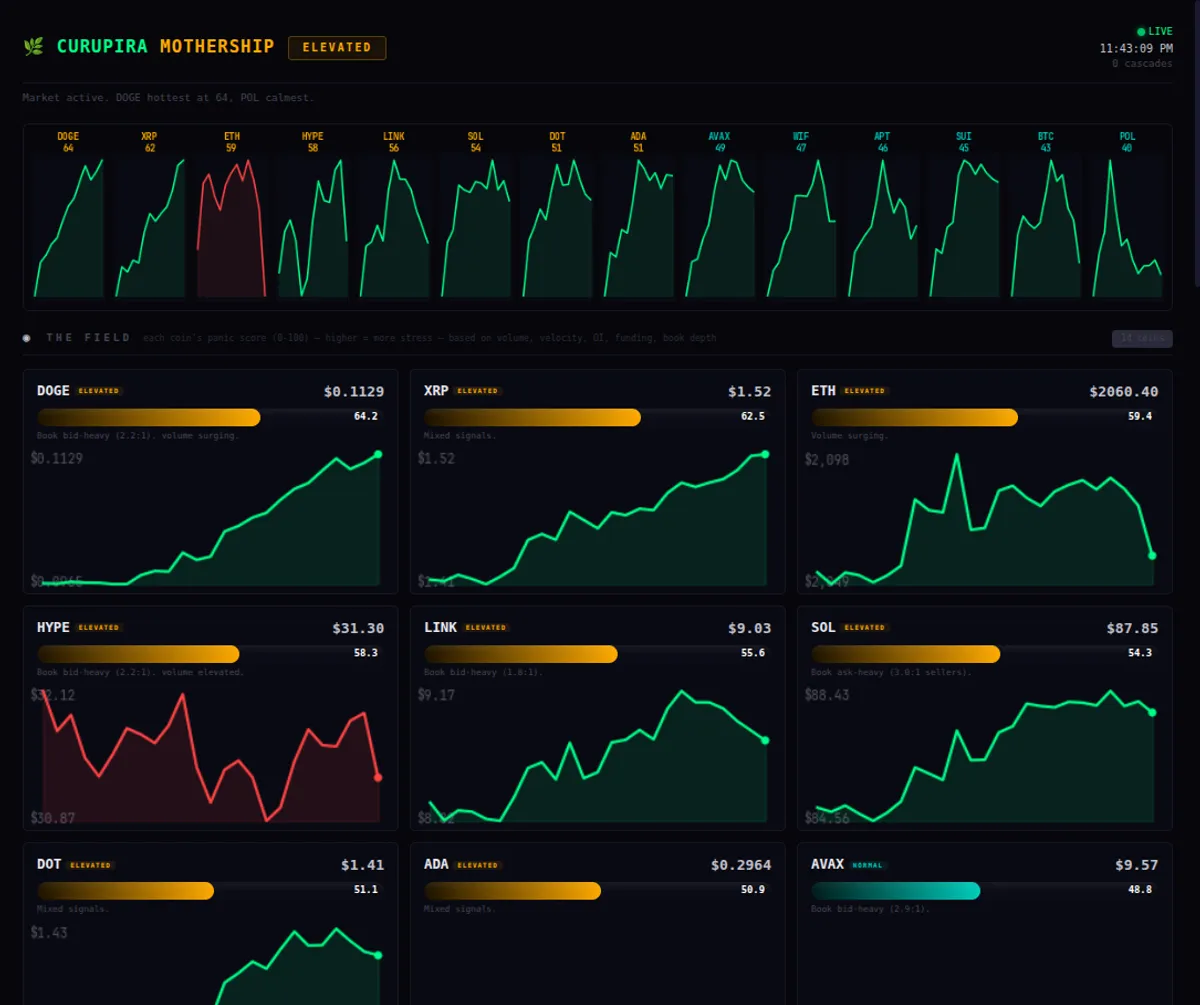
THE FIELD
Every coin gets a card: price, panic gauge (0–100, baseline 50), component breakdown, 48-hour sparkline. Sorted by panic score. The overview strip at top gives market pulse in a glance — red/green fills showing where stress is building.
The panic score composites five signals:
- Volume — whale footprints
- Price velocity — how fast the ground is moving
- OI change — positions opening or closing (conviction or capitulation?)
- Funding rate — which side is overcrowded and about to get squeezed
- Book imbalance — who’s stacking the order book and whether it matters
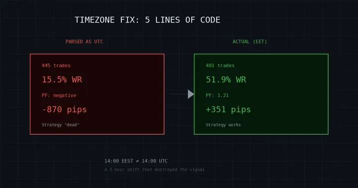
Each component scores 0–100 with 50 as baseline. Weighted composite. And here’s where we almost built the whole thing on sand: calibration.
We pulled 30,000+ funding rate records per coin and profiled actual distributions. Percentile buckets. Real data, not vibes. The result was embarrassing — our original watcher had a hardcoded funding threshold of 0.0005. The actual 95th percentile was 0.000012. We were 40× too high. Without that distribution work, every alert would have been a phantom. We’d been chasing ghosts before and weren’t about to repeat it.
THE WRECK ZONE
Full candlestick charts with liquidation zones painted on top:
- Red dashed lines — nearby liquidation levels (20x long, 20x short)
- Shaded bands — zones within 1% of current price (here be dragons)
- Text annotations — distant zones that would blow up the y-axis if plotted
- Funding rate subplot underneath, hourly bars
The y-axis scaling alone took five iterations. The first version showed a liquidation zone at $66K when BTC was at $69K, which compressed all the actual price action into an unreadable ribbon. Completely useless. Final solution: percentage-based zone inclusion. Only zones within 3.5% extend the chart. Everything else becomes a tiny edge annotation. Most time spent, most obvious answer in hindsight. The story of engineering.
A proximity bar sits above each chart. Orange line = price. Red zone = longs at risk. Teal zone = shorts at risk. When you’re 0.7% from a wreck zone, you know it immediately. No squinting at axis labels.
FUNDING PRESSURE
Heatmap. Coins on y-axis, hours on x-axis. Color intensity = funding rate magnitude. Green = shorts paying longs. Red = longs paying shorts. Current hour highlighted with a border. Custom diverging colormap because matplotlib’s built-in palettes look terrible for financial data. This is the one panel where you absorb the whole market in a single glance — who’s crowded, who’s about to pay for it.
THE CASCADE
Event timeline from the watcher. Every detected cascade logged with timestamp, coin, direction, panic score. Dashboard shows a density bar chart (events per hour) and compact timeline.
When we published this, we had 5 cascade alerts. All HOLD decisions. Observation mode. We were building a statistical profile of alert quality before letting the agent touch anything with real money.
That patience paid off. More on that below.
THE COCKPIT
Decision log and large trade table. Every alert the AI processes gets a structured entry: coin, score, direction, decision, reasoning. The table shows recent whale trades (>$50K notional). This is the audit trail — when something goes wrong at 4am, you need to reconstruct what the agent saw and why it did what it did.
Two Interfaces for Two Kinds of Intelligence
This was the best design decision in the whole system and it wasn’t planned. It just emerged.
curl localhost:8043/api/briefingReturns plain-text for the AI agent:
═══ CURUPIRA MOTHERSHIP ═══ 2026-02-14 22:42 Bahia

[FIELD] Market: ELEVATED  (avg 53.2, peak 65.9)
  DOGE $0.1129  panic=65.9  Volume surging.
  ETH  $2,061   panic=64.2  Book bid-heavy (2.6:1).

[WRECK ZONE] 6 coins within 10% of zones.
  🔴 DOGE 20x LONG → wreck $0.11, now $0.11 (2.6%)

[COCKPIT] 5 decisions | 20 large trades (24h)
[GRIND] Watcher ✓ (4s)  DB: 36,047 records
The human glances at the dashboard — candlesticks, heatmaps, color gradients — and gets a gestalt read in two seconds. Pattern recognition. Vibes.
The AI parses the briefing text and gets exact values for decision logic. Numbers, not patterns. Different interfaces for different kinds of intelligence. Neither is inferior. They solve different problems.
We didn’t plan this split. The AI just couldn’t reason about PNG charts, and the human couldn’t parse JSON fast enough. The constraint forced good design.
The Plumbing
Three data sources feed the Mothership:
-
liq-watcher (systemd service) — WebSocket feed, real-time panic scoring, cascade detection. Writes
watcher_state.jsonevery few seconds plus cascade events to JSONL. -
onchain-collector (systemd timer, every 30 min) — snapshots from Hyperliquid API: funding rates, open interest, mark prices. Writes to SQLite (
market_data.db, 36K+ records) and JSONL. -
price_history.jsonl — accumulated price ticks for chart rendering. Combined with snapshot candles and DB mark prices as fallback. Three sources, deduplicated into hourly buckets.
The wake chain:
cascade detected → /tmp/cascade-alert.json → openclaw cron wake
→ AI reads alert + briefing → evaluates → TRADE or HOLD
→ logs decision → clears alert
The watcher runs on a Dell Latitude 3500. No GPU. No cloud. localhost:8043. Watcher, collector, dashboard, AI agent — $0/day in infrastructure costs. The only expense is the AI subscription we were already paying for. The whole war room runs on a laptop.
Small Wins That Mattered
Preload-then-swap kills flicker. Images refresh every 30 seconds. Naive img.src = newUrl causes a white flash during load. Fix: create an off-screen Image(), set its src, wait for onload, then swap the visible element. Zero flicker. Small thing. Makes the difference between “dashboard” and “slidshow.”
50-baseline scoring. First attempt scaled 0–100 and everything saturated at 100 in calm markets. Every coin screaming at max panic when nothing was happening. Recentered at 50 for baseline. Per-coin calibrated thresholds from 90 days of distribution profiles. Now a score of 65 means something specific. A score of 50 means “nothing to see here.” Language matters in alerting systems — if everything’s an emergency, nothing is.
What the Data Actually Showed
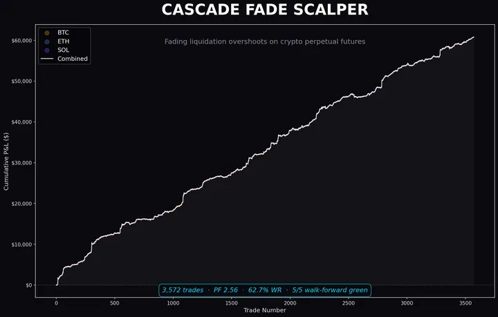
We left the watcher running. Over 18 days: 13,285 cascade events.
That dataset birthed the cascade-fade scalper thesis: do real cascades mean-revert? Can you fade them?
Mostly no.
At 5–60 minute holds, cascades are a coin flip. ~50% win rate. The intuition that “it’ll bounce back” is dead wrong at these durations. Cascades are self-reinforcing. More cascade breeds more cascade. The panic feeds itself.
But the data hid a surprise. At 1–3 minute holds on SOL specifically, there’s edge. Walk-forward profit factors of 1.44–2.68. Something about SOL’s microstructure — its liquidity profile, its market maker dynamics — creates a narrow window where the fade works.
BTC? Dead after we audited fill assumptions honestly. The spreads and slippage during cascade intensity eat any theoretical edge. You can’t fade BTC panic if you can’t get filled at the price you wanted. ETH? Fragile — 4 out of 5 walk-forward windows green, 1 dead. Not robust enough to trade but not a clean kill either. Limbo.
Even where the strategy failed, those 13K events were invaluable. They calibrated our proxy cascade detectors — we could measure detection accuracy against confirmed events. And they proved core physics: cascades are self-reinforcing at most timescales. That killed an entire class of naive “fade the panic” strategies before we risked a dollar on any of them.
The dashboard still runs. The data still accumulates.
Source Code
Research code lives at github.com/vedaripuruc/quant-research — watcher, collector, analysis, and Mothership dashboard code in the same monorepo.